
Understanding the WTP Pricing Graph
Our Demand & Revenue graph transforms raw data into a clear, actionable strategy. By analyzing the relationships between price, demand, and revenue, you can make confident decisions that maximize profitability. The graph provides concrete answers to critical questions, such as the price that generates the highest sales and revenue, and how much you can adjust the price without losing volume.
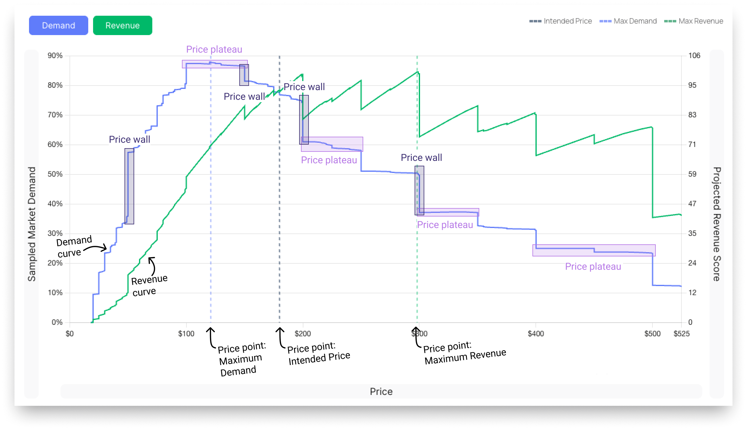
Demand Curve
This line represents the expected sales volume at different price points. As the price increases (moving from left to right on the horizontal axis), the demand generally decreases. The point of "Max Demand" indicates the price at which the highest number of units is sold.
Revenue Curve
This line shows the total revenue generated at each price point. Revenue is a function of price and demand. The goal is to find the "Max Revenue" point, which is the price that yields the highest total turnover.
Price Walls
A Price Wall is a specific price point where, if exceeded, a dramatic impact on demand or revenue occurs. This often represents a significant drop in volume, sometimes 5-10% or more, indicating a psychological barrier for customers. Identifying these walls is crucial for knowing the upper limits of your pricing.
Price Plateaus
A Price Plateau is a price range where a change in price does not significantly impact demand or revenue. These areas are valuable because they indicate flexibility in your pricing strategy. If you can increase your price within a plateau without losing demand, you have an opportunity to increase profitability.
Read More
- Maximum Demand and Revenue - how the demand and revenue curve are being generated and can how to leverage them.
- Price Points - explanation of our suggested price points.